
Data viz decoded: Stacker newswire’s best practices for insightful charts
Emma Rubin is an associate data editor at Stacker. This is the second edition of “From Our Newsroom to Yours,” covering tips, learnings and best practices from the Stacker Newsroom.
At Stacker, we produce over 20 stories featuring data visualization each month. These have ranged from maps on solar power capacity to line charts on girls’ participation in high school sports. Data viz is an effective way to convey key takeaways and add visual flair to a story, but it can be intimidating for journalists new to the medium.
In this edition, we'll break down some key considerations when creating data visualizations and share some resources so anyone in the newsroom can feel confident building charts.
Simplicity is key
When creating visualizations, you want the trends and takeaways to be immediately clear; that’s why aesthetic choices are so important.
- Sans-serif fonts are most readable for titles, labels, and annotations.
- Avoid redundancy. If your values are in percentages, the % sign doesn’t need to appear alongside every number, just the first value at the top.
- Color variation should be intentional when differentiating between categories, and charts without that variation usually need one hue.
- Balance your color selection for contrast when working with multiple categories or ranges. There are many resources for picking color families that you can start creating viz whether or not you think of yourself as a color coordination expert.
- I’m a fan of Learn UI Design, which lets you select a main color and create color palettes around it. However, you would need an external tool, such as ColorBrewer, to check if the palette works for readers with colorblindness.
The little things can go a long way
When adding text to visuals, make choices that enhance readability.
- Don’t make people tilt their heads to read what a chart is representing. Instead, explain the graph’s units within the chart or with a label directly above it.
- Align values on their left side. Putting labels on a bar chart closest to the bars may feel intuitive, but if you keep all labels left-aligned, the reader won’t have to move their eyes back and forth across the visual.
- Directly label categories or groups whenever possible instead of using a color key; this also helps keep the viewer’s eyes focused.
Picking the right chart
To keep this section brief, I’ll share an excellent resource from The Financial Times outlining chart types and the kinds of data best suited for each.
- While this source is comprehensive, simple line charts, column charts, and bar charts are often the most effective for many kinds of data. Don’t get caught up trying something new if a simpler format works better for highlighting a trend.
- Pie charts are controversial within the data viz community. Visually, it’s harder to see size differences between circle slices. If you think your data calls for a pie chart, consider bar charts, donut charts, or treemaps instead.
Why this chart works
Here’s a recently published chart: “How much does it cost to win Best Picture? Breaking down the biggest and smallest budgets.”
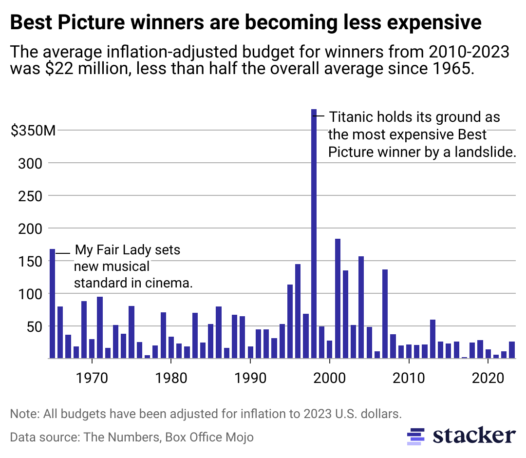
- Units on the Y-axis are clear and aren’t repeated on every label, creating a clean look.
- Annotations highlight outliers, provide supplementary information, and fill the negative space left from lower-cost years.
- Using a column chart instead of a line chart makes the sudden ups and downs in the data easier to read.
- Data is adjusted for inflation, making the budgets comparable from year to year.
Why this chart works
From Votebeat's “Arizona's federal-only voters are concentrated on college campuses, data show”:
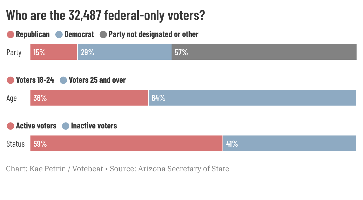
- The values of the bars are clearly labeled, and the colors are contrasting.
- The visualization’s title tells the reader what this chart will answer and weaves in a statistic on the raw number of federal-only voters in Arizona.
- Even though it uses a color key, its labels are clearly demarcated for each bar, and the reader doesn’t have to return to the top of the graphic to identify what each bar represents.
Getting started
There are many free sources for building charts.
- Google Sheets’ built-in chart feature is a great starting point and useful for exploring dataset trends.
- Datawrapper and Flourish are excellent newsroom resources, and here’s why:
- They offer several chart and map options with interactive and downloadable PNG options.
- Most importantly, they provide free options so any newsroom can dip their toes into data visualization.
- Both tools can help a newsroom’s adoption of chart-making by guiding and limiting the choices users can make while helping shape the teams' visualizations based on the priorities above.
- Both offer more customizable features in their enterprise plans, which allow you to select preset colors, fonts, and other style preferences. At Stacker, most of our charts are produced under our premium Datawrapper plan.
- Flourish and Datawrapper’s blogs are great resources for ongoing learning.
Data visualization may be powered by numbers, but it’s also an artistic medium. Remember: Following best practices to make charts clear and readable doesn’t have to clash with creativity.
To learn more about how the Stacker Newswire can help you grow and retain your audience, reach out to us @ publishers [at] stacker [dot] com.